
my role: UX Design Intern
10 weeks internship
Northwestern Mutual is a leading player in the insurance industry with 160 years of history. 5,000+ financial advisors are using Advisor Desktop (an internal digital tool) to help their customers.
However, the tool ended up with a user interface with lacked uniformity and struggled with user-friendliness, resulting in inefficiencies and user frustrations.
Recognizing these challenges, the design team decided to invest in a UI Consistency project.
Outcomes & Impact:
designed a new Card component resulting in a 40% reduction of vertical scrolling times to increase work efficiency
added an “8-pixel” layout guideline to enhance consistency
designed 3 responsive UI components in total
Improved user experience: consistent components across all internal tools provide a familiar working environment, reducing the learning curve and cognitive load, leading to a more intuitive experience
The beginning: learn the complex tool
methods I used to figure out workflows:
click on everything and take notes on ambiguities
have lunch with advisors to chat about what they don’t like about the tool
ask around for resources (research notes, previous design files, meeting recordings)
- my first three days of the internship


Audited all inconsistency issues and talked about design priorities with the manager and the PM
- 1 on 1 with my design manager

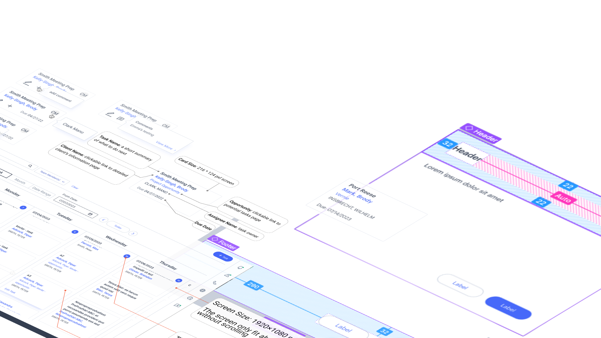
Priority: Card Redesign
Compared to other components, the card is a crucial element since it is used in multiple customer-related workflows.
The improvement of the card design directly impacts project tracking, task assignments, and customer management resulting in increasing work efficiency.
Problems with the current task card:
Layout inefficiency: wasted space takes much screen space
Unclear hidden interactions: edit task, change due date, change assignee (hidden features)
Inconsistency: different from other internal tools, cause confusion


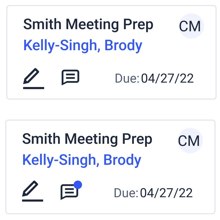
Example: how current task cards look like on a calendar-view page
Layout and size
change 01
user need: less scrolling
With the new design, required vertical scrolling times were reduced by up to 40% depending on screen sizes.
Optimize space: the task owner’s name gets moved to the top right corner, represented by a blue circle with an initial in it.
The name's initial design is quickly adopted because it aligns with other internal tools.

Calculate on how big the new card should be to fit into calendar view

responsive design for different screen sizes
No more hidden functions
change 02
user need: access comment faster and easier
The comment is a commonly used communication channel among advisors and their managers.
However, it is only accessible through the task editing page in the current design. Some users find it hard to navigate and view.
The new design got positive feedback on adding the icons to make comments quick to add and view.

Iteration:
Use only one icon to represent the comment feature
Add a notification blue dot to differentiate if there are comments
Task assignment
change 03
user need: see clear ownership
Being able to know task owners directly impacts task progress tracking.
Based on usability testing, the new empty circle design was intuitive and easy to understand that the task is missing an owner.


Interested in other components I designed?